Sketches for ident ideas

For my Ident design, I had three main ideas that I sketched
out by hand, this made it easier for me to see it put together (only two are
shown on the first page). However, this will not help with the technical aspect
of creating the ident on a computer. So I had to simplify my designs to the end
result of the idea I’d like to go with.
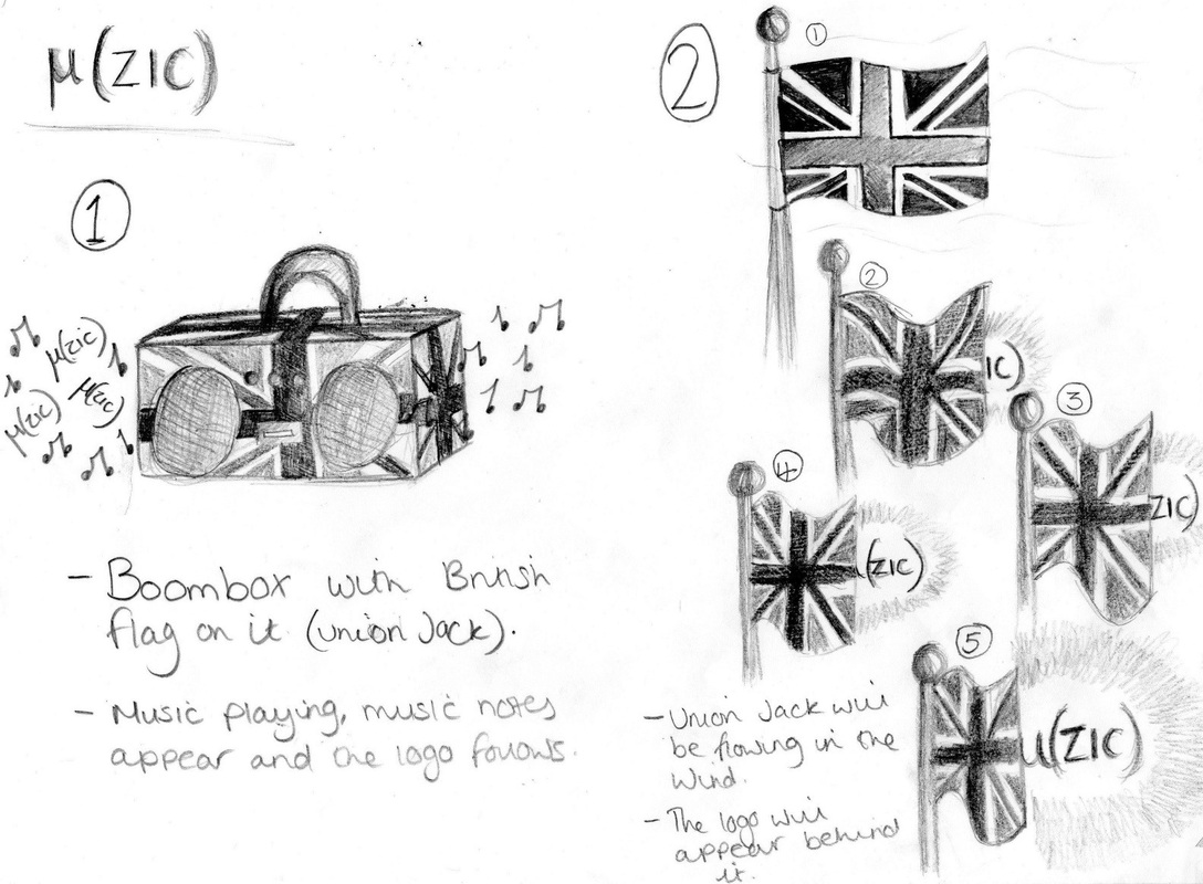
I thought of the brief and how Britain was mentioned and that we had to make it for a British company, so I began to draw designs. My first design was a boom box that had the Union Jack pattern printed on it and the logo µ (zic) would appear out of the speakers, to give the illusion of music notes and this will link to the music and British link. After sketching that out, I decided that it was a too complicated, and how I’d turn that into a near professional standard ident was troubling me, so I began to think of other ideas.
I still wanted to keep the Union Jack idea, as I thought this could increase my opportunity of creating British related ideas, so I thought of the actual flag. I sketched out a number of flags and gave the appearance of them all moving in the wind, and the logo would appear behind the flag as it moves. On the animation programme, I thought that this being the second idea could be something I could be capable of. I would only need to move the flag a couple times for it to create the illusion of it moving in the wind. However, I decided that this was not the time to be over ambitious, so I began to think simpler about the ident.
The third and final idea that I am hoping to use, makes it seem more possible to create an animated ident as I have used lines and simple shapes to create the effect. Again I have used the Union Jack and kept it as the traditional flag that may move slightly, depending on how skilled I get with the programme. The flag will slowly break into parts, as shown in the diagram on the first page. They will be in separate parts and slowly move across the screen to create the µ (zic) logo! Whether the logo will change to be curvy instead of straight and sharp corners depends on the appearance on screen. I wanted to preferably keep the sharp corners because I thought this would make it look bolder and stand out rather than a warm curve. But I am willing to experiment with the corners once the basic idea has been put forward.
With this particular ident, I wanted to put it forward as it will appeal to a wide audience because of its simplicity, and once it is on the screen, I will be able to add extra effects to make it more visually appealing. I didn’t have to use the Union Jack to make sure it was British but I liked the idea of using traditional symbols of Britain, also it works perfectly with my idea of the movement in the animation.
The colours that will be in my ident will be the bold blues and reds that will be in the flag and this will be because it will appear more smoothly with the transition between the flag and the logo. There is an opportunity to change the colour once the logo is complete as I have shown in the last image on the sketch, and this will be a bold colour so the audience will remember the ident. I thought of mixing the colours, perhaps using a gradient effect to make it more interesting than using just two colours separately. But I will be experimenting with this once I see it on screen.
With typography, I went through the lists of fonts and decided nothing worked with the image I wanted to create. I also looked online at possible fonts to download and noticed a couple that worked nicely, they were medieval/gothic type of fonts and I thought this related to my traditional British image. I thought of keeping the straight bold lines for the morphing and then slowly changing the logo into the medieval font. This will give it character and variation. I want the movement from the flag to the logo to be clear and smooth, without any glitches to make it appear to the professional standard I am aiming for.
